
- Published on
Building a Flexible Grid Component in Sitecore Headless with Tailwind
- Authors

- Name
- Jorge Lusar
When working with Sitecore Headless JSS, one of the common needs is to give content authors more control over page layouts. Sitecore ships with a ColumnSplitter.tsx component out of the box, but it relies on Twitter Bootstrap’s grid system.
In projects where Tailwind CSS is already the chosen styling framework, Bootstrap can feel redundant. That’s why I decided to create a Tailwind-powered Grid component that reuses the logic of the ColumnSplitter while replacing Bootstrap’s markup with Tailwind’s grid utilities.
The result? A leaner, more consistent way to manage layouts—without adding another CSS framework into the mix.

The Problem with the Default Column Splitter
The default ColumnSplitter.tsx works fine, but it comes with some drawbacks if your team has standardized on Tailwind:
- Bootstrap dependency: Pulls in an entire framework just for layout utilities.
- Rigid markup: It uses Bootstrap’s row/col structure, which doesn’t map neatly to Tailwind.
- Styling inconsistency: Mixing Bootstrap and Tailwind often leads to bloated, conflicting stylesheets.
The Tailwind Approach
Here’s the custom Grid component I built. It lets authors configure grid layouts through Sitecore component parameters, but under the hood it leverages Tailwind’s grid utilities under /Presentation/Styles/Grid:
- Grid columns →
lg:grid-cols-2,lg:grid-cols-3,lg:grid-cols-4,lg:grid-cols-6 - Grid column span →
lg:col-span-1,lg:col-span-2,lg:col-span-3,lg:col-span-4
This gives editors freedom to define how many columns appear and how wide each column should be.
import {
  ComponentParams,
  ComponentRendering,
  Placeholder,
} from '@sitecore-jss/sitecore-jss-nextjs';
import { clsx } from 'clsx';

interface GridProps {
  params: ComponentParams;
  rendering: ComponentRendering & { params: ComponentParams };
}

const Grid = ({ params, rendering }: GridProps): JSX.Element => {
  const enabledPlaceholders = params.EnabledPlaceholders.split(',');
  const id = params.RenderingIdentifier || undefined;
  const styles = params.Styles;
  const columnStyles = [
    params.Styles1,
    params.Styles2,
    params.Styles3,
    params.Styles4,
    params.Styles5,
    params.Styles6,
    params.Styles7,
    params.Styles8,
  ];

  return (
    <section className={clsx(styles ?? styles)} id={id}>
      <div
        className={clsx(
          'container grid max-w-[1062px] gap-6',
          styles ?? styles
        )}
      >
        {enabledPlaceholders.map((ph, index) => {
          const phKey = `column-${ph}-{*}`;
          const phStyles = `${columnStyles[+ph - 1] ?? ''}`.trimEnd();

          return (
            <div key={index} className={phStyles}>
              <Placeholder key={index} name={phKey} rendering={rendering} />
            </div>
          );
        })}
      </div>
    </section>
  );
};

export default Grid;
Benefits of This Approach
1. Tailwind Consistency
Everything stays in the Tailwind ecosystem—no more mixing and matching with Bootstrap. That means a smaller CSS footprint, consistent design tokens, and cleaner utility-based classes.
2. Lightweight and Performant
Dropping Bootstrap removes unnecessary bloat. Tailwind is already optimized for production builds, so the CSS bundle remains lean.
3. Editor Flexibility
By mapping Sitecore component parameters directly to Tailwind grid classes, authors can:
- Pick how many columns the grid should have
- Control column spans per placeholder
- Apply extra Tailwind utility classes when needed
This strikes a balance between editor freedom and developer guardrails.
4. Reusable and Scalable
The logic mirrors Sitecore’s default ColumnSplitter, but is framework-agnostic. This makes it easier to extend—whether that’s adding responsive breakpoints, custom gaps, or even CSS grid templates for advanced layouts.
5. Cleaner Separation of Concerns
The component handles structure, while Tailwind handles styling. No custom CSS overrides, no Bootstrap grid quirks—just a semantic grid with utility classes applied.
Real Usage Example
To show how this works in practice, let’s look at a grid configured with:
- Grid layout:
lg:grid-cols-3 - Column spans:
- Column 1 →
lg:col-span-3 - Column 2 →
lg:col-span-1 - Column 3 →
lg:col-span-2 - Column 4 →
lg:col-span-2 - Column 5 →
lg:col-span-1
- Column 1 →
In the Sitecore Page Builder, it looks like this:

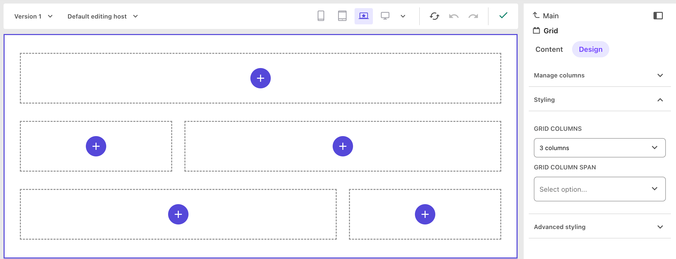
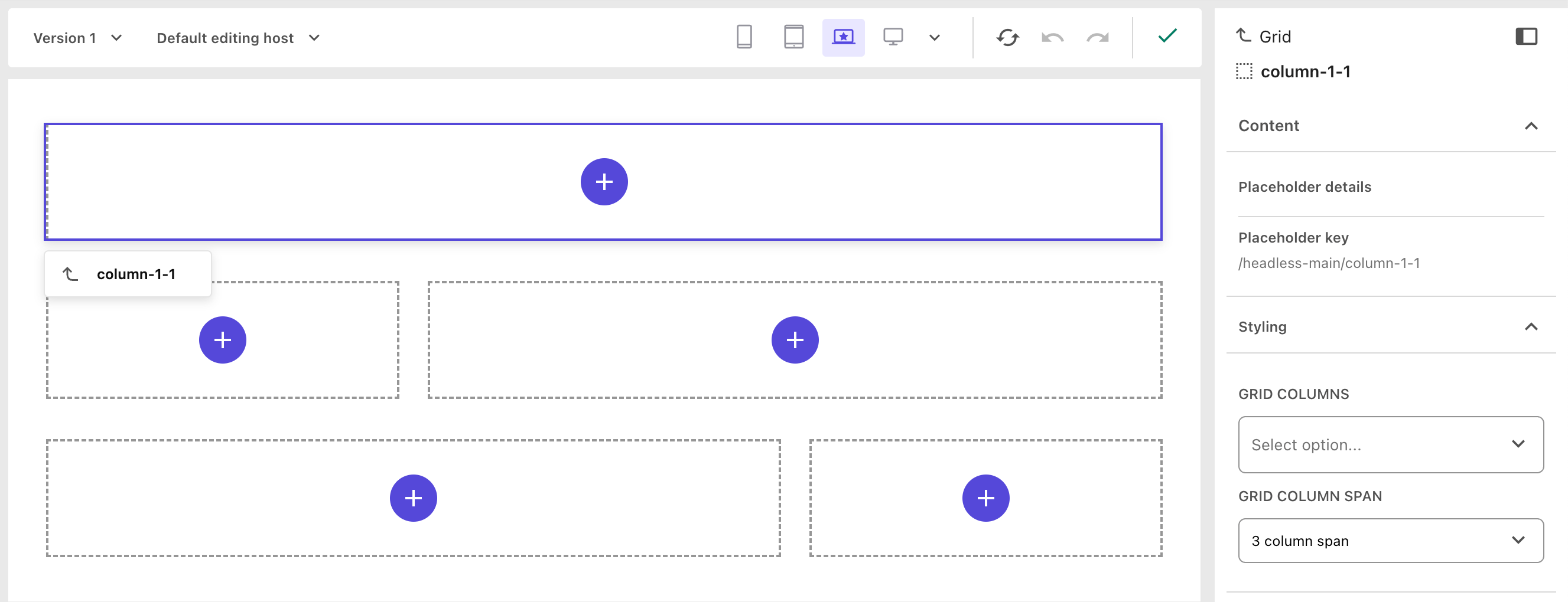
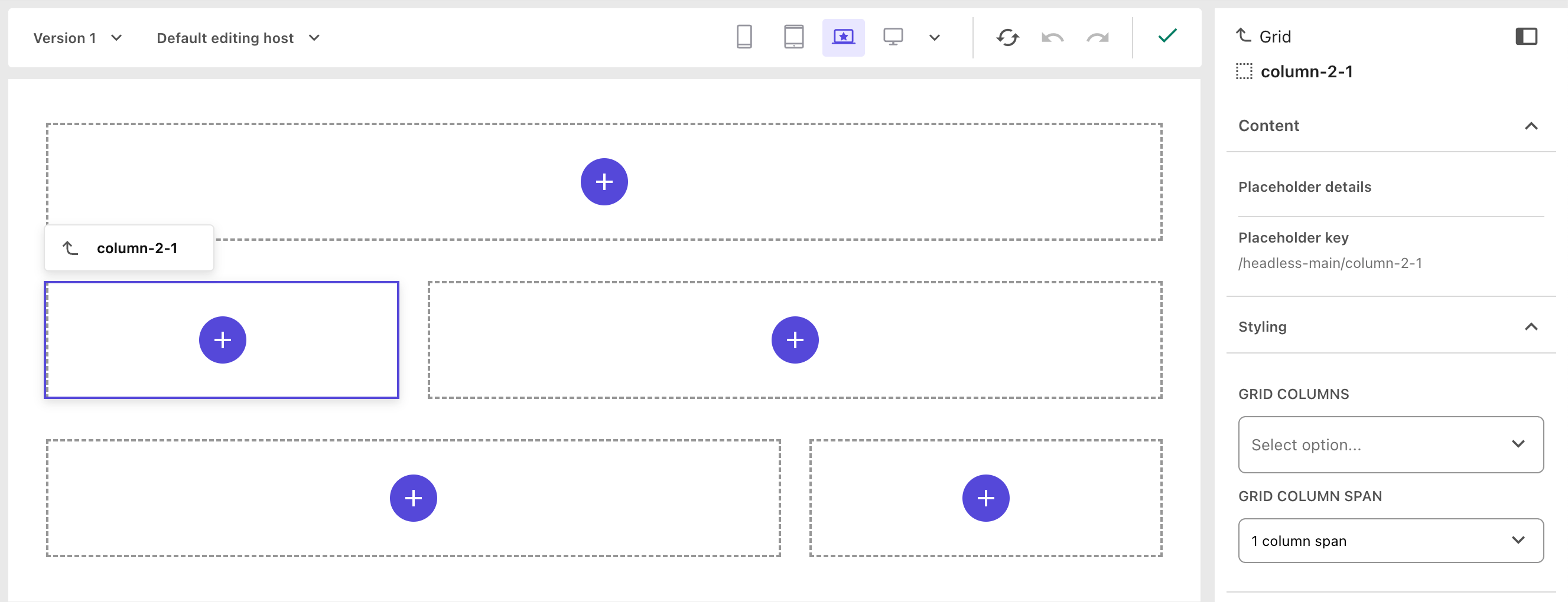
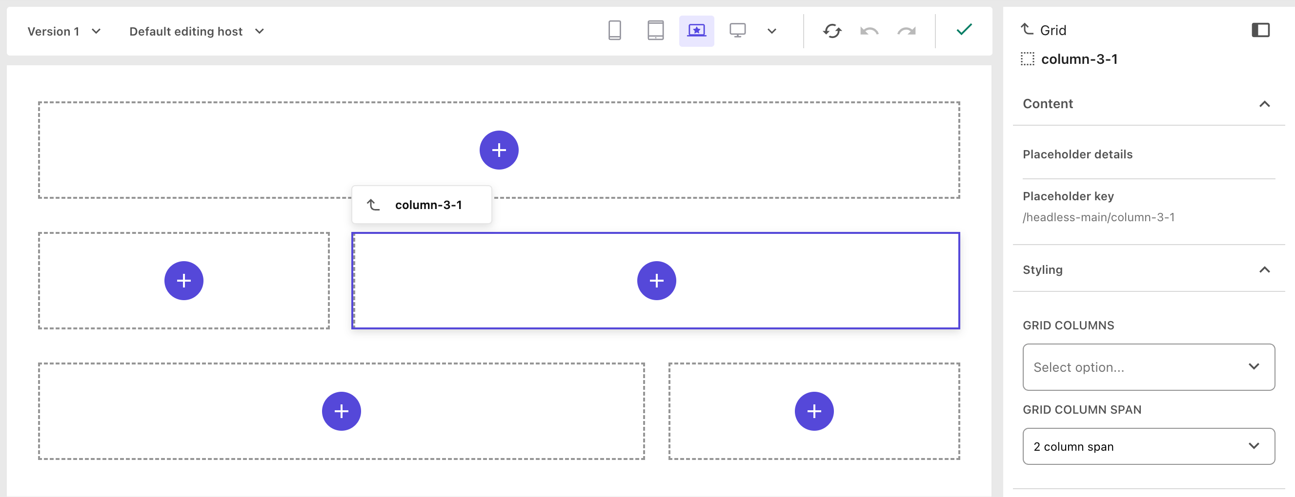
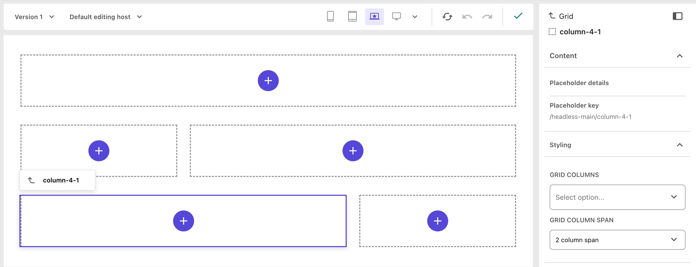
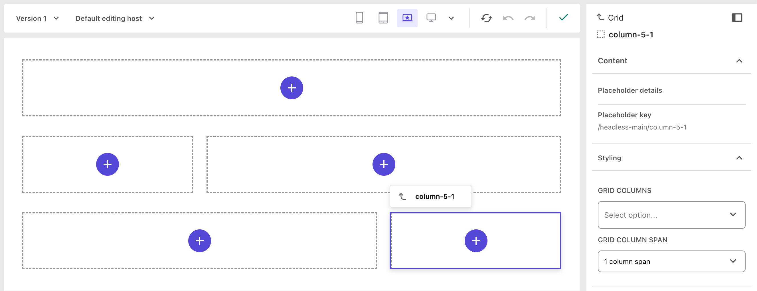
Each dashed box represents a placeholder where editors can drop components. The Tailwind classes (lg:col-span-*) determine how much space each column takes up in the grid.
This approach lets editors visually compose complex layouts—all while keeping the underlying CSS simple and Tailwind-driven.
Final Thoughts
Replacing Bootstrap’s ColumnSplitter with a Tailwind-driven Grid may seem like a small change, but it has an outsized impact:
- Cleaner CSS bundles
- More predictable layouts
- Happier developers (and editors)
If you’re building a Sitecore Headless + Tailwind project, this approach keeps your stack focused and future-proof.